
New Generation Responsive Web Design
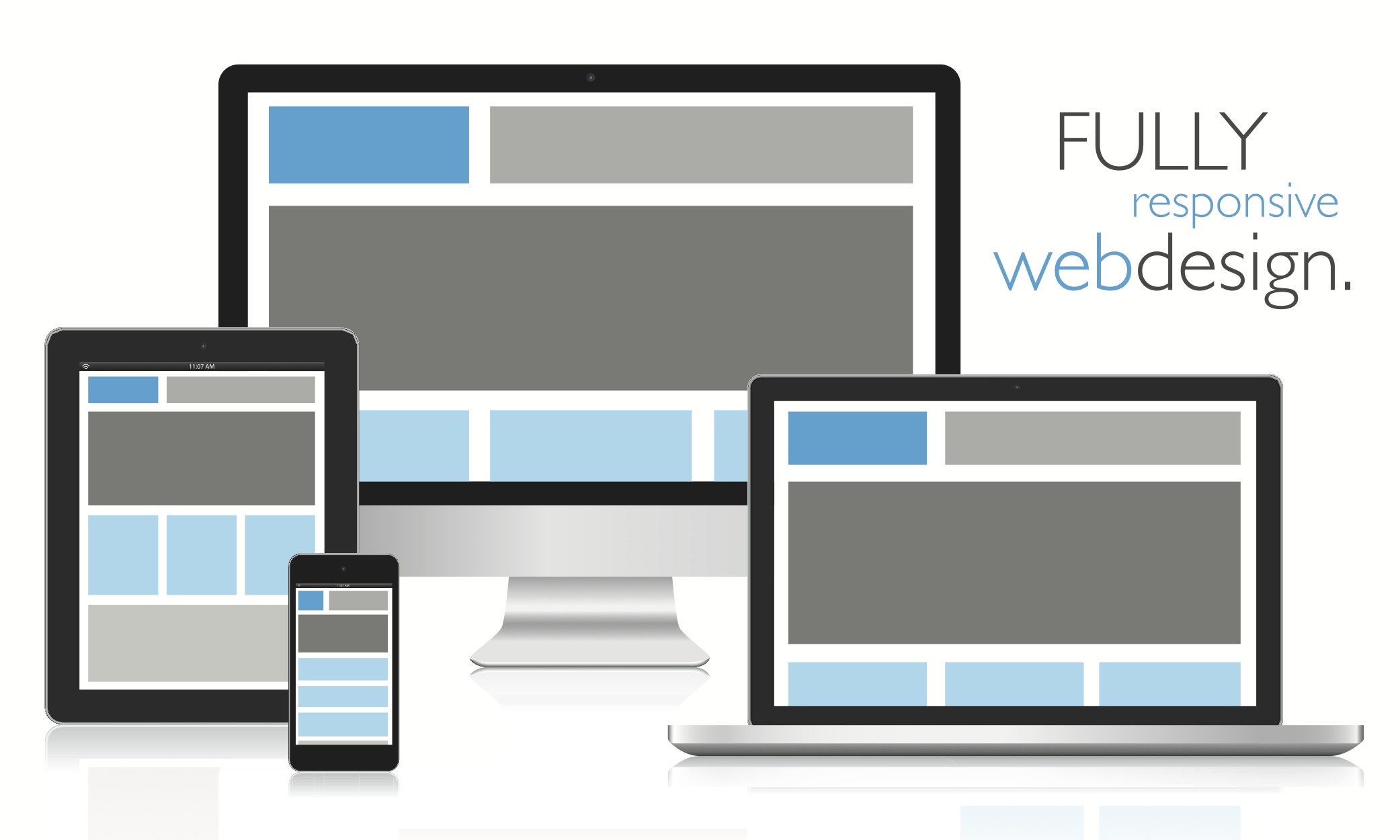
This is latest & most important trend in website design & development industry. We are designing mobile-ready responsive websites since last few years and we keep upgrading ourselves with latest trends.More and More visitors are accessing your website today using smart phone, mobiles and tabs. So for all visitors your website should automatically adjust itself and be best viewed with your design and content. This adaptation is called as Responsive Web Design and also referred as mobile compatible website or tab compatible website.
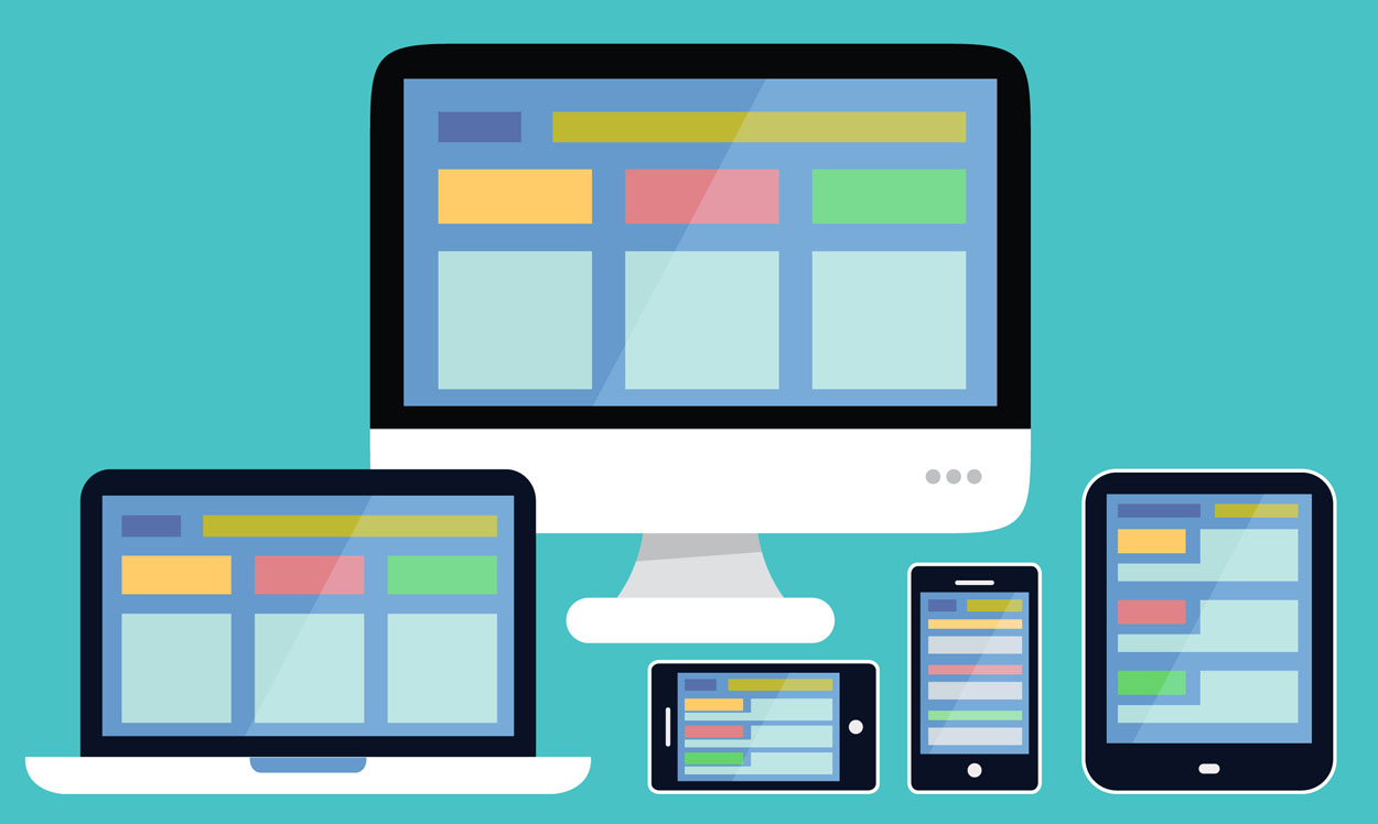
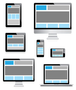
Responsive web design is web technology developed considering how website can be viewable on different types of devices available in the market. Responsive web design helps to view single website in different designs which is automatically adjusted according to device screen size & orientation.The priority of any website is to provide good user experience to visitors & help them to provide content they are looking for. Responsive web design helps website owner to capture & convert traffic for your product or service on every device.
We Create New Generation User Experience With Clean, Impressive & Good Looking Design. At ImagineScript, we work to make our clients happy. We understand you & your customer before starting the project.
Benefits of responsive web design
Cost effective
Responsive website design eliminates need of mobile application or mobile website for business website. One website design fits on all devices so no need of maintain two separate websites. This results in reducing application development & website maintenance cost.
Google & SEO
It is easier to crawl mobile friendly website pages for Google search engine crawlers. If your website is mobile-friendly then Google mention in its search result. Having mobile-friendly website can drastically reduce bounce rate as well. Responsive web design is always have positive impact on your business website.
Mobile Features
In responsive web design you can add mobile specific features, which help to boost conversion. E.g. Opt-in form can be replaced with direct call button, which is easy for any visitor to make direct call instead of filling form.
Control on content
Content can be displayed as per priority according to device type & orientation. Adjustment in design helps to let visitors focus on content of their interest.
Responsive web design features
• Mobile first design
• Design optimization for mobile, tablet & desktop
• Mobile feature integration
• Light weight & faster page loading web pages
• Cross browser
Responsive Website Design Services
CLEAN, INNOVATIVE AND USER FRIENDLY DESIGN
All of our web designs are built in-house thus giving unique look to your website. Our web designers invests their time to create web solutions that make your website feel "real" without adversely affecting the core objective of the website. Our web design services will get you the results that you always wanted. Our websites are clean, clear and customized to your needs!
SEARCH ENGINE FRIENDLY
When people search for your product or service, the search engines bring your website up in the results. This balance of beautiful web layout and search engine web design draws highly targeted prospects to your site and sells them on your product or service once they’ve arrived.
BROWSER COMPATIBLE
We provide browser compatible web design service. Our website look good and working well on all major browser.
If you’re searching for ways to generate more traffic and more conversions from your website, you need to understand why your website should be cross browser compatible. To help you comprehend the importance of adding this feature to your website, we’ve created a practical quick guide.
We have a rapid rate of increase in mobile browsing online. Some studies suggest that mobile browsing will outpace desktop browsing within a span of 2 years. If you want to remain competitive, it’s imperative to invest in a responsive website design which is a mobile friendly website design.
To explain in a simple language, responsive web design is a different way to design sites but it represents the future of where the web design technologies are going. Making website mobile compatible and tablet compatible
Responsive web design is a design approach that is geared towards using one central site to provide the optimal browsing experience for multiple viewing platforms. The responsive web design uses W3C standards and CSS3 media queries with fluid proportion-based grids, to adapt the layout to the viewing environment, and also flexible images that would responsively adjust on-the-fly. As a result, users across a broad range of devices and browsers will have access to a single source of content, laid out so as to be easy to read and navigate with a optimal user interface, and minimize panning and scrolling.